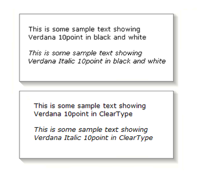
cleartype
I discovered something new today that some of you may already know. When Microsoft released the Windows XP operating system, they included a feature that dramatically increases the readability of screen fonts on LCD displays. The problem is that not only did they not enable the feature by default, they buried so deep inside the Display control panel that almost no one can find it.
Cleartype uses sub-pixel anti-aliasing to increase font smoothness. These pages explain the process in much more detail. Apple has embedded similar technology in OS X, and whenever I have used Macs I have admired the fonts in documents and spreadsheets. Now that I have switched on Cleartype on my XP laptop, my Mac envy is reduced
Studies suggest that Cleartype increases in reading speed and reduces eyestrain. Even though it trades edge definition for that result, I think it looks much better. If, judging by the below samples (click for full size) you do as well, here is the best way to turn on Cleartype.
1) Confirm that you have Windows XP and a LCD display. Although Microsoft claims that Cleartype works well on CRTs, many CRT users complain of blurriness
2) Install the ClearType powertoy from the links on this page
3) Follow the settings wizard for optimal results
The result: a big improvement for fonts in folders, menus, web pages, email and Office files. If you only have time to try one tip from (at least) one cool thing, make this the one.

1 Comments:
cleartype rocks. thanks paul.
and thanks apple.
-sj
Post a Comment
<< Main page